Method --> Madness
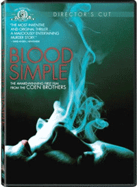 I love the Coen Brothers and if my DVD collection were lost or destroyed, I'd replace each Coen movie without hesitation. I know this for sure because I did it this weekend with Blood Simple. I'd somehow lost the thing and picking up a new copy was a good excuse to watch it again. It ages well.
For some reason, though, I became hyper-aware of little visual cues and situations that have wandered their way into other Coen films and many of them began with Blood Simple. Examples:
- The private investigator that shadows his mark in a VW Beetle (also in The Big Lebowski)
- The killer looking behind a shower curtain for his next victim (also in Fargo and No Country For Old Men)
- Dragging a dead body backwards to his car in the face of oncoming traffic (also in Fargo)
- Opening narration against stills of a western desert landscape (also in Raising Arizona and No Country)
- A fresh glass of milk as evidence that the killer had just left (also in No Country)
Roughly a year and change ago, a very big client (who I won't name, but you've heard of them) commissioned me and my associates for a themed multimedia piece. They wanted to demonstrate the notion that there are old, expensive, antiquated ways to perform certain business processes, but their product does it faster, cheaper and better.
We ran through a number of possible scenarios, each one stranger more interesting than the last, but my favorite was the concept I called "Flat Earth". In a nutshell, I wanted to show that hanging onto traditional methods of doing things with blind faith is as foolish and useless as hanging onto the belief that the Earth is flat. So, the themed idea: we'd structure the visuals around the idea of a 15th century nautical map, decorated with sea dragons and mythological beasts and, one by one, debunk the "myths" of this particular business process.
I roughed out a concept and it looked like this:
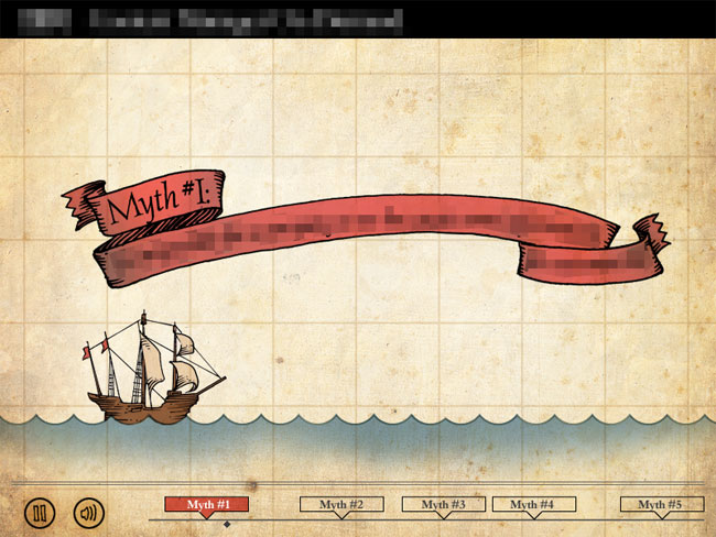
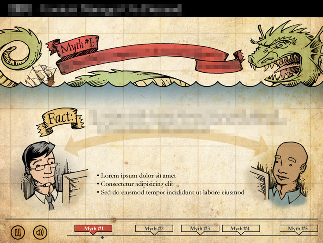
It was kind of a weird idea for such a conservative client and they predictably declined in favor of something far more watered down and corporate and, frankly, far less memorable. Their prerogative, no problem, you get used to that.
But it's kind of a bummer when you actually get enthused about an idea and you can't use it. Best thing to do: file it away for later. Someone somewhere will come along and it'll be perfect for them. Just wait.
And it wasn't long before it hit me that, hell, maybe I'll just use it for my own website.
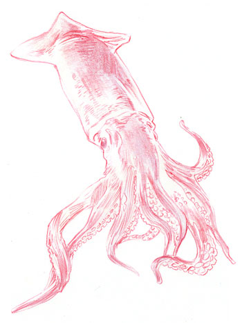
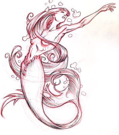 I mean why not? Mermaids, sea monsters, wooden caravels, barnacles, decorative seals and ribbons... it's all the sort of thing I love to draw anyhow. And my brain was already swimming, pardon the pun, with 15th century nautical imagery from all the research into Spanish history I'd been doing for my big graphic novel project.
Trouble was, it's not "edgy".
Everybody and their cousin is "edgy" these days. If it's not Web 2.0 looking (yawn), it's sharp and minimalist with glassy reflections and smooth gradients organized into tight columns with thumbnailed content puzzle-pieced into place. Or failing that, it's beveled and drop-shadowed all to hell. Hey, I love white space as much as the next guy, but everything has taken on that Canned Blog look anymore and I can't tell one super-hip site from the next.
And, really, that's what cinched it for me. "Flat Earth" wasn't edgy! It was anti-edgy! It was so friggin' un-modern, it would stick out like a sore thumb. Everyone wants to stand out and everyone's trying to do it using the same techniques. Well, f*** that. What would a website designed in 1450 look like? I don't know, but that's what I'd like to look at.
So my mantra became "do the opposite." Everybody uses sans-serif fonts these days. Screw 'em, mine'll use all serifs. Everyone uses minimalist white or black or gray. Forget that, I want my site to look ragged and old and stained. Websites are written in punchy, easy-to-digest sound bites that get the idea across in nanoseconds. Well, up yours, I want my descriptions and subheads to be convoluted and overblown, using pretentious, flowery speech that's a chore to read.
 And another thing, it's not kosher to do a website like this completely in Flash. A site comprised of literally hundreds of pages and independent components, all in one interface? It's not what Flash was made for. Search engines hate it and updating it is insanely unproductive. Yeah, but this is my site and I make the rules and if I want to make something that makes no sense from a development standpoint, that's up to me, isn't it?
So I started mapping it out in early January and I uploaded the initial version of it in late December. Yeah, you read that right. A personal website that was a year in development.
But who cares. I'm actually happy with my site for the first time ever because it's the first time I've ever had a website that truly represents who I am and what I do. Like my Obnoxious Boners comics blog, it's a perfectly accurate snapshot of my personality. If you want to know what it's like to work with me... if you want an idea of the sort of work I can do for you and how I approach creative problems, check out JeremyBear.com.
Look, I'm not saying my site is an example of Ultimate Design or anything like that. I know it's loaded with flaws and missteps and it's probably got about 10 weaknesses for every strength, but that's a pretty good description of me too.
And it's true: you're your own worst client. You know, those clients that drive you berserk because they want their brochure to be All Things To All People. And you try to explain to them that it can't be, that they'll eventually have to pick a theme and stick to it or they'll wind up with non-remarkable mud. But when the shoe's on the other foot, you don't want the same rules to apply to you.
Anyhow, I know this has been long-winded and I apologize. But to sum up: don't be afraid to recycle an idea. It's allowed, particularly if it was your idea to begin with.
Oh, and I hope you like the new design. It'll be up for awhile.
posted by Jeremy Bear at
10:41 PM
5 Comments
![]()
![]()